

//TIMELINE// ⏰
September 2023 - April 2024 (8 months)
//SCOPE// 📝
User Experience Design
User Interface Design
eDM Campaign
//MY ROLE// 🙋♂️
UX Lead - Experience Designer & Researcher
//TEAM// 👨👩👧👦
Thomas White - Experience Designer
Keith Magnus - Senior Digital Designer
Sylvia Jahn - Account Director
Anthony Areci - Account Manager
Vikalp Srivastava - Project Manager
//Project Overview//
We've all wanted to go overseas at some point, surely. 🌏 Imagine you're a university student. You've wanted to learn more about the study opportunities abroad, and now it's time to make that a reality. But, how do you do it? 🧐
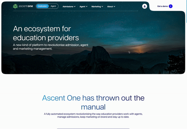
In comes Ascent One! A global management system for educational institutions and international student agents. The Ascent One platform gives institutions the ability to target overseas students directly, by connecting with the agents in those countries.
Once the agents have found the student, they use Ascent One throughout their entire student lifecycle, from enrollment to graduation. It is a robust system that enables the student to have a truely streamlined enrollment experience, from targeted comms to personalised brochures.
So what was our goal? To make Ascent One the number one tool for international student management! 🥇
//What did we do//
For us to first understand the business and it's customers, I ran a deep discovery phase that we used to learn everything we could about Ascent One.

Discovery workshop 🧰
We ran a two day discovery workshop in Melbourne as a way of both meeting with client and to learn more about the Ascent One business. As part of this, we formulated our 12-18 month goal for the project, uncovered risks with the Sailboat exercise, and created two empathy maps to build proto-personas to be validated with interviews.
To gain a deeper understanding of Ascent One for Ogilvy to understand the business’ long-term goals and product offerings. We want to create a deep empathy with the customers and uncover potential user needs and pain points in the journey.
- Workshop challenge
Customer interviews 🗣️
I ran 8 customer interviews with 6 university representatives across Australia and 2 agents to learn more about their thoughts and experiences with Ascent One, validating the personas made during the workshop. We made sure to find people with a wide range of experiences, from positive to negative, ensuring we removed potential biases from our research.
We synthesised the findings down to 3 key themes: Product, Data & Privacy, and Marketing & Comms.


Journey map 🗺️
I collated all the customer information from the discovery phase into a single artefact, that maps out the user journey from need to adoption of the platform, their pain points and user actions throughout the journey, as well as potential strategic opportunities both digital and non-digital.

//What did we learn//
Institutions are unaware of the services offered by Ascent One
We need to improve Ascent One's overall marketability by spreading awareness of the full suite of services that it can provide. This can be achieved by highlighting the unique capabilities of the platform when compared to competitors and how it can help both institutions and agents.
Data is king, and institutions want control over it and their systems
A lot of institutions take international agent management in house because they have a strong desire to maintain control over their international agents through the use of performance tracking. We need to emphasise how Ascent One allows them to maintain control, giving them peace of mind around tracking, security, and data privacy.
There are too many manual processes
Currently, institutions are finding with their internal systems that they are spending too much time manual sifting through data and students. This is mainly due to the fact that they want to have control. We must use this as an opportunity to emphasise how Ascent One removes the need for these manual processes, thereby saving the institutions time and ensuring they reamin cost effective.
Institutions are looking for a flexible system that works for them
Institutions want to keep costs low, but they also want a custom system that works specifically for them. We need to ensure that we educate them on the end-to-end capabilities of the Ascent One system, but also showcase how the system is flexible so they can only purchase the products that fits their wants and needs.
//Wireframes//

//Pre-work//
Before starting the wireframes, I ran a competitive analysis both in and out of category to see how other software companies grouped their products and structured their content pages.
This information, alongside the findings from our discovery work, not only fed into how we structured our content, but also our main navigation and overall information architecture.


//Behavioural principles//
To ensure I am designing a site for maximum user engagement, here are some of the behavioural science principles I implemented.
Progressive disclosure
We want to reduce the cognitive load placed upon our users. To do so, we present users with bite sized pieces of information, where they have to engage with the website to reveal more details.
We have used progressive disclosure to list product features and benefits, only presenting a few up front and hiding the rest off screen.
Chunking
Users are more likely to process information when we put it into smaller groups. This reduces the level of cognitive overload placed on users, and allows them to digest information at their own speed.
We have grouped products together under product suites, ensuring that customers can view each product in the context of their use case.
Social proof
Users are more likely to make a decision if they feel their choice is validated by the majority. They reference other's behaviour to guide their thoughts.
We added in testimonials from customers who have used Ascent One, tags for popular products and suites, and have listed the institutions that use Ascent One as a way of building trust with new users.
//Some things to note//


Institution / Agent split
Toggle within the navigation and landing page to view products for institutions and agents separately. Since there is no crossover between products for the two user groups, it allows the user to stay focused on their journey and view products that are only relevant to them.
I put these products into a mega menu within the navigation to ensure scalability for future product launches, and to make information easier to digest for users.
Tiered pricing model
To ensure we are remaining flexible with user needs, we have introduced a tiered pricing model that will give customers what they need, no matter the budget.
To help drive sales, I used the anchoring bias to give users the illusion of better value while nudging them to pick the price point we want.
(Prices here are placeholder and not indiciative of the true value of the product) 🤐


//Final designs//
Once approved, I began to compile all my work into a component based design system. This ensured once handover to the client had been completed they had a breakdown as to each component and its variations, as well as how and when to use it. Working closely with the UI designer, I helped to apply the new brand tone and styling to all the designed pages for desktop and mobile.

Product suite grouping
-
Institutions and agents have seperate landing pages to split up their products.
-
Products are further divided into product suites, to help with SEO and further seperate products into their own contexts.
-
Users are able to view products according to their own needs, and ignore the suites that aren't relevant to them.
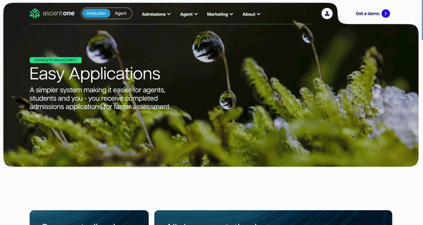
Dedicated product pages
-
Products now have individual pages for users to read on the features and benefits.
-
Pages built using a component led design system, future proofing in the case of new content.
-
Users can view which additional products work best, so they can build out a package that meets their business needs.

//Outcome//
Throughout our process, we made sure to keep the client involved, scheduling regular comms and meetings to ensure they were cross all our work.
Come the end of the project, the client was so impressed by not only the work itself, but our ways of working. So impressed that they opened up a regular retainer for consistent work with us!
New work has already started on a partner website to Ascent One, and you may see it here soon 👀
Keeping clients happy, it's what we do 😇

//Wanna read more?//

