
BMS ONCall Redesign

//TIMELINE// ⏰
March 2023 - October 2023 (9 months)
//SCOPE// 📝
Market Research
User Experience Design
User Interface Design
//MY ROLE// 🙋♂️
UX Lead - Experience Designer
//TEAM// 👨👩👧👦
Thomas White - Experience Designer
Vidhi Doshi - Digital Project Manager
Paola Pelligro - Senior Digital Designer
Luke Smith - Senior Account Director
Scarlet Adam - Senior Account Manager
//Project Overview//
Imagine: a global brand like by Bristol Myers Squibb (BMS), leaders in the oncology space in health care. They have a platform called ONCall that's meant to be a handy portal for oncologists. It's got all the BMS-related oncology content they need. You open the site, and 💥 - it's cluttered, confusing, and poorly designed. Not exactly what you want when you're looking for important content to stay educated.
In comes Ogilvy! Our mission? Give ONCall a total makeover 💅. We're talking a modern design with fresh branding, new colours and a whole new visual style.
We used this opportunity to work cross functionally between the Ogilvy Experience and Ogilvy Health teams, working in an agile way to deliver results to a client that had never gone through such an extreme digital transformation.

//Setting the stage//

We embarked on a multi-month journey to educate the client to proper UX practices, to deliver a solution that would benefit all customers.
In order to deliver a product that satisfies all customers, we first needed to identify who's who in the ONCall ecosystem. We leveraged existing research previously conducted by BMS to identify two mental models that users sit within.
To deliver this back, we formally presented the research and findings combined with a competitor analysis and draft information architecture as a way of contextualising our findings with a formal output.
Originally resistant to the idea, the client loved how we were able to take the research that they had been sitting on and examine under our UX lens.
//Research//
So, what did we find? Through the research, we identified what our users would want while navigating through the website.
22.1%
prioritise ease of use
18%
prefer personalised information
17%
want information to be updated regularly
//User mental models//
In order to capture and re-engage users, need to learn more about what makes them tick. In doing so, we identified the two mental models.
Hunters
Oncologists who are know specifically what they want. They will visit the website to search for a specific type of tumour or cancer type.
Explorers
Oncologists who do not have a goal in mind and prefer to generally browse the site. They want to stay informed, but may not need anything specific.
//Wireframes//
Once the base discovery phase was concluded, we jumped straight into design. This ran over multiple months and many versions of wireframes were built, based off feedback from previous versions. Our ultimate aim was to design templates of the core pages that could be reused throughout the site, future proofing the website and enabling the clients to create pages on their own should the need arise.
To continue to build trust with the client in our design process, we ensured that we kept them involved throughout the journey. We scheduled weekly co-design feedback sessions, wherein we would present the work that had been done that week, and then take feedback live from the client so we could implement it before their eyes.
We utilised the agile UX process, working in sprints, doing one set of designs per week, to ensure we were delivering on our timeframe and meet the client's delivery expectations.
All of this allowed us to have a healthy back and forth, where we could trial solutions in real-time and showcase/justify our own thinking and why we made certain choices compared to others.

//What could we improve?//
Increased discoverability
Content on the current site gets lost. To increase visibility of content, there is the potential to add tags in order to help users discover content through search and filters.
Personalisation to preferences
Oncologists want to see content that is relevant to them. They are unlikely to explore outside of their speciality. To make their experience feel tailored, we allow users to set preferences during onboarding. This will lead to a customisable dashboard where they are only served the content they want to see.
Create a more engaging way to consume content
Users consume BMS content through PDF downloads and external links. Moving content on site by creating media pages for videos and articles will increase user time on site and drive engagement.
Indication specific topic hubs
The platform should allow users to navigate through indication (cancer types) specific pages. These pages should be hubs for all content pertaining to the indication, including drug information, materials, and media content.

//Final designs//
Once approved, we began work on applying styling to the wireframes. We defined fonts stylings to be used throughout the site, defined primary and secondary colour palettes, created a new iconography style, and outlined the UI elements.

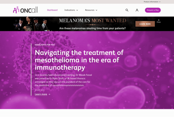
Personalised dashboard
-
Set preferences during onboarding and see relevant information directly to your practice
-
Quick access to tools and resources tailored to you
-
Details of local BMS representatives based on your postcode
-
Continue watching videos that you've previously started
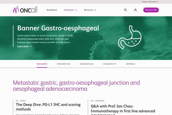
Indication topic hubs
-
Hubs set around specific indications and their medicines.
-
Users can navigate through drug specific information, ensuring they stay involved with clinical trials and key info pieces.
-
Content is all live on-site, with access to PDF downloads to share offline.
-
Dedicated indication materials page, with filters and tags to sort through content type, date, and topics.

//Wanna read more?//

